
こんにちは!
最近OANDA APIで遊ぶのにハマっている、たっきん(Twitter)です!
前回はOANDA APIを使って為替レート値を取得するプログラムを作りました。

今回はその応用として、取得した為替レート値をビジュアライズしてローソク足チャートを作成していこうと思います。
ビジュアライズするとなると何かしらのパッケージ・ライブラリを使う必要があるので、まずはその選定からですね。
条件としては、
- Pythonに対応していること
- あまり複雑なコードを書かずに描写できること
くらいですかね?
定番なものとしてはMatplotlibがあります。
MatplotlibはMATLABライクな可視化ライブラリであり、手軽にプロットしたい場合に重宝します。
実際に僕もよく使っていました。
しかし、最近はさらに画期的な可視化ライブラリがあるようです。
それは、Bokehというパッケージ・ライブラリです。
Bokehとは?
Bokehと書いて、「ボケ」と読むそうです。
BokehはMatplotlibと同じ可視化ライブラリなのですが、Matplotlibが備えていない画期的な機能があります。
それはインタラクティブ(対話)操作が可能なことです。
対話操作と聞くと難しく感じる方もいるかもしれませんが、要は描写したグラフをユーザーが操作できるんです。
まぁものは試しということで、どのように動かせるのか試して見せますね!
Bokehのインストール
以下のコマンドを実行するだけです。
$ conda install bokehBokehでローソク足チャートを描写してみる
ソースコードはこんな感じになります。
# ==============================================================================
# brief        ローソク足チャートの描写
#
# author       たっきん
#
# 事前準備 :
#     oandapyV20のインストール (pip install oandapyV20)
#     Bokehのインストール(conda install bokeh)
# ==============================================================================

import datetime
from math import pi

from bokeh.layouts import Column
from bokeh.models import RangeTool
from bokeh.plotting import figure, show, output_file
from oandapyV20 import API
from bokehlib import bokeh_common as bc

from fx import oanda_common as oc
from fx import your_account as ya
import oandapyV20.endpoints.instruments as instruments
import pandas as pd


class CandleStick(object):
    """ CandleStick - ローソク足定義クラス。"""

    def __init__(self):
        """"コンストラクタ
        引数:
            なし
        """

        self.__CANDLES = "candles"
        self.__MID = "mid"
        self.__O = "o"
        self.__H = "h"
        self.__L = "l"
        self.__C = "c"

        self.__TIME = "time"
        self.__VOLUME = "volume"
        self.__OPEN = "open"
        self.__HIGHT = "high"
        self.__LOW = "low"
        self.__CLOSE = "close"

        self.__WIDE = 12 * 60 * 60 * 1000  # half day in ms

        self.__WIDE_SCALE = 0.2

        self.__BG_COLOR = "#2e2e2e"
        self.__CND_INC_COLOR = "#e73b3a"
        self.__CND_DEC_COLOR = "#03c103"
        self.__CND_EQU_COLOR = "#ffff00"

        self.__api = API(access_token=ya.access_token,
                         environment=oc.OANDA_ENV.PRACTICE)

    def drawCandleStick(self, instrument, datetime_from, datetime_to,
                        granularity, fig_width=1000):

        params = {
            "alignmentTimezone": "Japan",
            "from": datetime_from,
            "to": datetime_to,
            "granularity": granularity
        }

        # APIへ過去データをリクエスト
        ic = instruments.InstrumentsCandles(instrument=instrument,
                                            params=params)
        self.__api.request(ic)

        self.__data = []
        for raw in ic.response[self.__CANDLES]:
            self.__data.append([raw[self.__TIME],
                                raw[self.__VOLUME],
                                raw[self.__MID][self.__O],
                                raw[self.__MID][self.__H],
                                raw[self.__MID][self.__L],
                                raw[self.__MID][self.__C]])
        # リストからデータフレームへ変換
        df = pd.DataFrame(self.__data)

        df.columns = [self.__TIME,
                      self.__VOLUME,
                      self.__OPEN,
                      self.__HIGHT,
                      self.__LOW,
                      self.__CLOSE]
        df = df.set_index(self.__TIME)
        # date型を整形する
        df.index = pd.to_datetime(df.index)

        print(df)

        inc = df[self.__CLOSE] > df[self.__OPEN]
        dec = df[self.__OPEN] > df[self.__CLOSE]
        equ = df[self.__CLOSE] == df[self.__OPEN]

        set_tools = bc.ToolType.gen_str(bc.ToolType.PAN,
                                        bc.ToolType.WHEEL_ZOOM,
                                        bc.ToolType.BOX_ZOOM,
                                        bc.ToolType.RESET,
                                        bc.ToolType.SAVE)

        inc_color = self.__CND_INC_COLOR
        dec_color = self.__CND_DEC_COLOR
        equ_color = self.__CND_EQU_COLOR

        # --------------- メインfigure ---------------
        fig1_len = int(len(df) * self.__WIDE_SCALE)
        enddt = oc.OANDA_GRN.offset(df.index[-1], granularity)

        plt1 = figure(
            plot_height=400,
            plot_width=fig_width,
            x_axis_type=bc.AxisTyp.X_DATETIME,
            x_range=(df.index[-fig1_len], enddt),
            tools=set_tools,
            background_fill_color=self.__BG_COLOR,
            title="Candlestick example"
        )
        plt1.xaxis.major_label_orientation = pi / 4
        plt1.grid.grid_line_alpha = 0.3

        # draw Candle Stick (increment)
        plt1.segment(df.index[inc], df[self.__HIGHT][inc], df.index[inc],
                     df[self.__LOW][inc], color=inc_color)
        plt1.vbar(df.index[inc], self.__WIDE, df[self.__OPEN][inc],
                  df[self.__CLOSE][inc], fill_color=inc_color,
                  line_width=1, line_color=inc_color)

        # draw Candle Stick (decrement)
        plt1.segment(df.index[dec], df[self.__HIGHT][dec], df.index[dec],
                     df[self.__LOW][dec], color=dec_color)
        plt1.vbar(df.index[dec], self.__WIDE, df[self.__OPEN][dec],
                  df[self.__CLOSE][dec], fill_color=dec_color,
                  line_width=1, line_color=dec_color)

        # draw Candle Stick (equal)
        plt1.segment(df.index[equ], df[self.__HIGHT][equ], df.index[equ],
                     df[self.__LOW][equ], color=equ_color)
        plt1.vbar(df.index[equ], self.__WIDE, df[self.__OPEN][equ],
                  df[self.__CLOSE][equ], fill_color=equ_color,
                  line_width=1, line_color=equ_color)

        # --------------- レンジツールfigure ---------------
        plt2 = figure(
            plot_height=150,
            plot_width=fig_width,
            x_range=(df.index[0], enddt),
            y_range=plt1.y_range,
            x_axis_type=bc.AxisTyp.X_DATETIME,
            background_fill_color=self.__BG_COLOR,
            toolbar_location=None,
        )
        plt2.xaxis.major_label_orientation = pi / 4
        plt2.grid.grid_line_alpha = 0.3

        # draw Candle Stick (increment)
        plt2.segment(df.index[inc], df[self.__HIGHT][inc], df.index[inc],
                     df[self.__LOW][inc], color=inc_color)
        plt2.vbar(df.index[inc], self.__WIDE, df[self.__OPEN][inc],
                  df[self.__CLOSE][inc], fill_color=inc_color,
                  line_width=1, line_color=inc_color)

        # draw Candle Stick (decrement)
        plt2.segment(df.index[dec], df[self.__HIGHT][dec], df.index[dec],
                     df[self.__LOW][dec], color=dec_color)
        plt2.vbar(df.index[dec], self.__WIDE, df[self.__OPEN][dec],
                  df[self.__CLOSE][dec], fill_color=dec_color,
                  line_width=1, line_color=dec_color)

        # draw Candle Stick (equal)
        plt2.segment(df.index[equ], df[self.__HIGHT][equ], df.index[equ],
                     df[self.__LOW][equ], color=equ_color)
        plt2.vbar(df.index[equ], self.__WIDE, df[self.__OPEN][equ],
                  df[self.__CLOSE][equ], fill_color=equ_color,
                  line_width=1, line_color=equ_color)

        range_tool = RangeTool(x_range=plt1.x_range)
        plt2.add_tools(range_tool)
        plt2.toolbar.active_multi = range_tool

        output_file("candlestick_sample001.html",
                    title="candlestick.py example")

        show(Column(plt1, plt2))    # open a browser


if __name__ == "__main__":
    cs = CandleStick()

    fmt = '%Y-%m-%dT%H:%M:00.000000Z'

    instrument = oc.OANDA_INS.USD_JPY
    datetime_from = datetime.datetime(year=2018, month=9, day=1, hour=12,
                                      minute=0, second=0).strftime(fmt)
    datetime_to = datetime.datetime(year=2018, month=12, day=15, hour=12,
                                    minute=0, second=0).strftime(fmt)
    granularity = oc.OANDA_GRN.D
    cs.drawCandleStick(instrument, datetime_from, datetime_to,
                       granularity)
他にも関連する自作ライブラリとかあるので、僕のGitHubに上げておきました!
対象のスクリプトは「candlestick_chart.py」です。
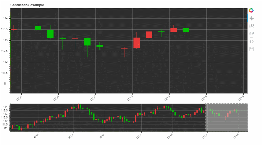
実行するとhtml形式のファイルが出力され、以下のようなローソク足チャートが表示されます。
カーソルを操作することでチャートを動かすことができます。
これがインタラクティブ(対話)操作です。
実際に動かしてみたい方は以下のhtmlファイルをブラウザで開いてみてください!
今日のところはこんな感じですね♪
次回何やるかまだ決まっていませんが、面白いことができたらまたブログ更新しますね!


コメント